What is Typography in UI/UX Design?
Typography refers to the art and technique of arranging type to make written language visually appealing and readable. In UI/UX design, typography plays a vital role in shaping the user experience by conveying tone, guiding users, and ensuring legibility across different screen sizes. Designers must balance aesthetics with functionality to create effective interfaces.
Why Typography Matters: The Impact on User Experience
Typography significantly influences user experience by:
- Improving readability and usability
- Setting the mood and tone of the interface
- Guiding the user through actions or content with visual hierarchy
A well-thought-out typographic system fosters smoother navigation and better retention of information.
Readability vs. Legibility: Key Differences for Designers
- Readability: How easily a block of text can be understood (affected by font size, line spacing, and paragraph length).
- Legibility: The ease with which individual characters are recognized (influenced by font type and design).
Balancing these elements ensures users can efficiently interact with the design.
Choosing Fonts for Digital Interfaces: Key Considerations
When selecting fonts, designers should consider:
- Screen Adaptability: Fonts must render well across devices.
- Consistency with Brand Identity: Typography should reflect the brand’s tone.
- Performance Impact: Some fonts may affect loading times, especially on mobile.
Serif vs. Sans-Serif: When to Use Each

Serif Fonts in UX/UI
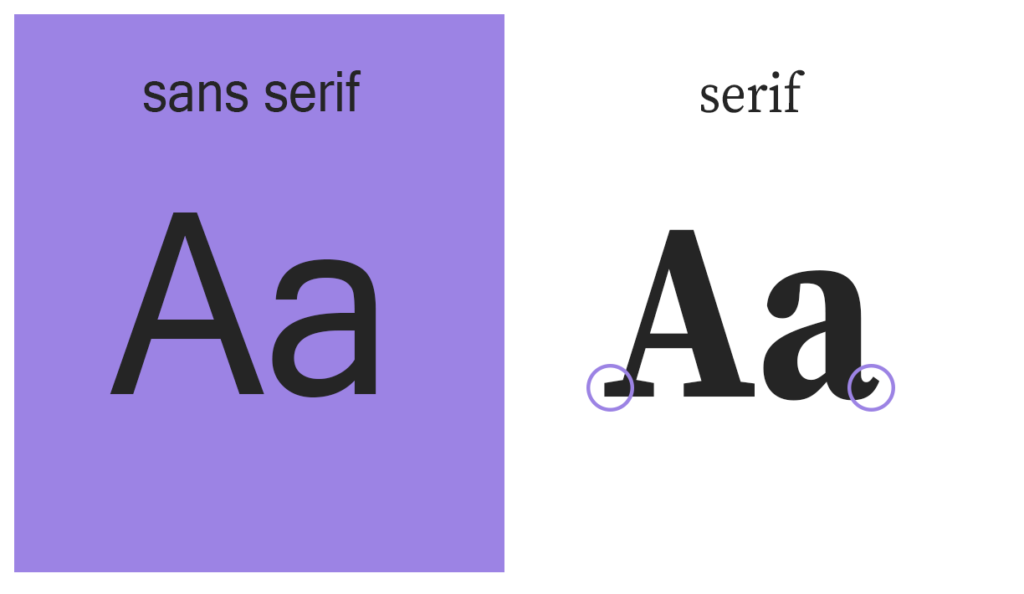
Serif fonts have small lines or “feet” at the ends of letters, often used to create a sense of tradition or trust. In UX/UI design, they can be ideal for titles and headings, particularly in professional, finance, or editorial contexts. Examples like Times New Roman or Georgia offer familiarity, while modern serif fonts can balance readability with style.
Sans-Serif Fonts and Their Importance
Sans-serif fonts lack the decorative lines of serifs, lending a cleaner, more modern feel. They are often preferred in digital design for body text due to their readability at small sizes. Fonts like Arial, Helvetica, and Roboto are popular sans-serif options in UI/UX design, conveying clarity and simplicity that suits contemporary digital interfaces.
- Serif Fonts (e.g., Times New Roman): Best for formal content and print designs.
- Sans-Serif Fonts (e.g., Arial): Ideal for modern and digital interfaces, offering better readability on screens.
Font Pairing Techniques for UI/UX Design
Pairing fonts effectively involves selecting complementary styles that create contrast without overwhelming the design. A common approach is to combine a serif font for headers and a sans-serif font for body text.
Hierarchy and Structure: Using Fonts to Guide User Flow
A strong typographic hierarchy ensures users can quickly scan and navigate content. Use larger, bold fonts for headers, and smaller weights for secondary information. Proper alignment and spacing also play a role in guiding users.
Accessibility in Typography: Designing for All Users
Designing with accessibility in mind involves choosing fonts that are easy to read for people with visual impairments. The Web Content Accessibility Guidelines (WCAG) recommend:
- Sufficient contrast between text and background
- Avoiding decorative fonts for essential content
UI typography rules UX
- Limit Font Choices
Stick to 1–2 fonts to avoid clutter. Generally, one font for headings and another for body text (or even just one versatile typeface) keeps the design cohesive and easy to follow. - Maintain Hierarchy
Create a clear hierarchy by varying font sizes, weights, and styles. Headlines, subheadings, and body text should differ enough to guide users naturally through the content. - Use Readable Fonts
Choose fonts with good legibility, especially for small screens. Sans-serif fonts (like Arial, Helvetica) are generally preferred in digital interfaces for their readability. - Control Line Spacing (Leading)
Appropriate line spacing enhances readability. For body text, line spacing should be around 1.4–1.6 times the font size to give each line enough breathing room. - Set Proper Contrast
Ensure that text stands out against its background to improve legibility. High contrast is especially important for accessibility, but be careful not to use too much contrast, as it can strain the eyes. - Apply Consistent Alignment
Align text consistently across the interface, whether it’s left, center, or justified. Left alignment is usually easiest to read, especially for body text in most languages. - Pay Attention to Font Size
Make sure font sizes are optimized for the screen, usually 16px or above for body text on web interfaces. Headings should be clearly larger but balanced. - Avoid All-Caps Text
Use uppercase sparingly as it can be harder to read, especially in long sections of text. Save it for short elements like buttons or titles to grab attention. - Responsive Typography
Adjust typography for different screen sizes to maintain readability across devices. This includes resizing fonts, adjusting line spacing, and ensuring hierarchy is preserved on mobile. - Use Color and Emphasis Carefully
Color and emphasis (like bold or italic) should be used strategically for calls to action, important information, or alerts. Overuse can create visual noise and reduce the impact of these elements.
Variable Fonts: The Future of Typography in UI/UX Design
Variable fonts allow designers to adjust a single font’s weight, width, and style, reducing load times and enhancing flexibility in responsive design. They are becoming a preferred choice for dynamic and adaptive interfaces.
Top Font Libraries and Websites for UI/UX Designers
- Google Fonts
- Google Fonts offers a large collection of free, web-optimized fonts. Known for its easy integration and variety, it’s a top choice for designers looking for high-quality fonts that load efficiently on websites.
- Adobe Fonts
- Available with Adobe Creative Cloud, Adobe Fonts provides thousands of premium-quality fonts. The free plan includes access to a curated selection, while the full library is available through a paid Creative Cloud subscription.
- FontSquirrel
- FontSquirrel curates a collection of high-quality, 100% free fonts, suitable for commercial use. They also offer a Webfont Generator, allowing you to convert fonts to web-friendly formats.
- Behance
- Behance is a great platform for discovering unique, designer-created fonts. Many font creators share free downloads here, though licensing varies, so always check usage rights before downloading.
- DaFont
- DaFont has a vast library of fonts, including unique and themed options. While many fonts are free for personal use, commercial licenses may require payment. It’s great for creative or decorative fonts.
Typography Trends in 2024: What’s New for UI/UX Designers
This year, we see a rise in minimalist fonts like Neo-Grotesque styles and bold typography in interfaces. These trends reflect a shift towards simplicity and impactful visual design.
Common Typography Mistakes in UI/UX Design (and How to Avoid Them)
- Overusing Fonts: Stick to 2-3 fonts to maintain consistency.
- Ignoring Accessibility: Test fonts for readability on various screens and ensure compliance with accessibility standards.
Conclusion: Typography as a Core Element of UI/UX Success
Typography is more than just a design element—it’s a strategic tool that can shape how users perceive and interact with an interface. Investing time in typography ensures better usability, accessibility, and overall user satisfaction.
FAQs
1. What is the role of typography in UI/UX design?
Typography helps convey tone, ensures readability, and guides users through the interface.
2. How many fonts should I use in a UI/UX project?
Stick to 2-3 fonts to maintain consistency and avoid visual clutter.
3. What are variable fonts, and how do they benefit design?
Variable fonts allow dynamic adjustments in weight and width, improving performance and flexibility.
4. Which fonts are best for accessibility?
Fonts like Arial and Verdana are recommended for their readability on screens.
5. What’s the difference between serif and sans-serif fonts?
Serif fonts are more formal, while sans-serif fonts offer better readability for digital screens.
6. How do I maintain consistency in typography across a project?
Use a style guide that outlines font choices, sizes, and weights.

