10 Key Elements of UI (User Interface) Design
Introduction: The Essentials of UI Design
User Interface (UI) design is the process of building the visual components users engage with, such as buttons, icons, typography, and menus. Great UI ensures an intuitive and seamless experience by balancing aesthetics and usability. Below are ten key elements of UI design that form the foundation of effective digital interfaces.
1. Buttons

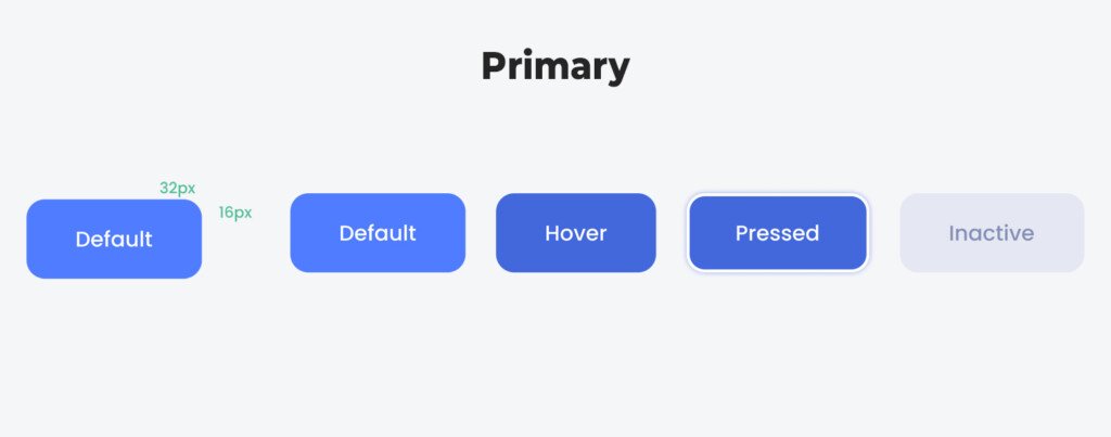
Buttons are critical for initiating user actions, such as submitting a form or opening a new page.
- Types of Buttons:
- Primary Buttons: Highlight the main action (e.g., “Sign Up”).
- Secondary Buttons: Offer alternative actions (e.g., “Cancel”).
- Icon Buttons: Represent actions using only icons (e.g., a heart icon for “Like”).
- Button States:
- Hover: Visual change when the cursor hovers over the button.
- Active: Button appearance when clicked or tapped.
- Disabled: Indicates the button is inactive and can’t be clicked.
2. Icons
Icons are compact visual cues that communicate actions or information.
- Action Icons: E.g., play, share, or delete buttons.
- Status Icons: E.g., Wi-Fi signal strength or battery indicators.
- Scalable Icons: SVG icons ensure clarity across devices of all sizes.
Icons must be consistent and intuitive to avoid confusing users.
Best websites offering both free and premium icon libraries
Flaticon – Extensive icon library with various styles and customization.
flaticon.com
Icons8 – High-quality icons with options for different styles and formats.
icons8.com
The Noun Project – Thousands of icons with a focus on diversity and inclusivity.
thenounproject.com
Font Awesome – Widely-used icon library, easy to integrate with web projects.
fontawesome.com
Material Icons by Google – A sleek set of icons designed for modern interfaces.
material.io/icons
3. Grids and Layouts
Grids provide the structure for organizing content. A well-structured layout ensures that elements align consistently across the page.
- Common Grid Systems: 12-column grid, used widely for web interfaces.
- Responsive Layouts: Grids adapt seamlessly to screen sizes from mobile to desktop.
- Whitespace and Margins: Proper use of spacing ensures that elements breathe and content doesn’t appear cluttered.
4. Typography
Typography focuses on the style, structure, and readability of text across the interface.
- Font Selection: Choose fonts that suit the brand and are easy to read.
- Text Hierarchy: Use headings, subheadings, and body text to structure content.
- Line Height and Spacing: Enhance readability with appropriate letter and line spacing.
Typography not only conveys information but also shapes the product’s visual identity.
5. Color Schemes

Color influences user behavior, mood, and navigation across the interface.
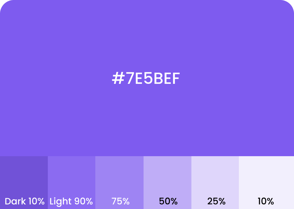
- Primary and Secondary Colors: Primary colors highlight important actions, while secondary colors support the theme.
- State Colors: Green for success, red for errors, yellow for warnings.
- Contrast and Accessibility: Ensure text and visual elements are visible for users with visual impairments.
Color schemes need to align with branding while maintaining usability and accessibility.
Here are some popular websites for finding color palettes:
- Coolors – Generates color palettes with easy customization.
coolors.co - Adobe Color – A robust tool for creating and exploring color schemes.
color.adobe.com - Color Hunt – A curated collection of trendy color palettes.
colorhunt.co - Paletton – Offers interactive palette creation for color harmony.
paletton.com - Colormind – Generates palettes using deep learning from various sources.
colormind.io
6. Forms and Input Fields

Forms are essential for collecting user information, such as login credentials or feedback.
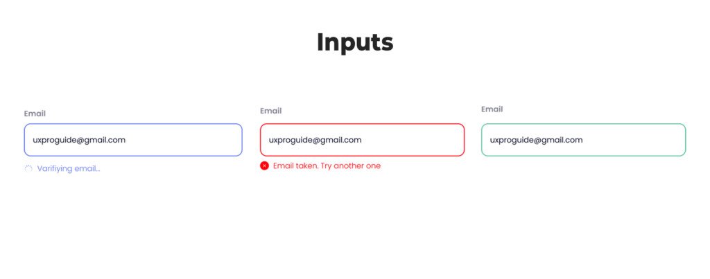
- Labels and Placeholders: Clear labels avoid user confusion.
- Validation Feedback: Real-time validation prevents incorrect entries.
- Error Messages: Display helpful feedback (e.g., “Invalid email address”).
- Input Types: Dropdowns, radio buttons, and checkboxes allow varied data entry options.
A well-designed form streamlines data collection, encouraging users to complete the process.
7. Navigation Bars and Menus

Navigation elements guide users through different parts of an interface.
- Top Navigation Bars: Display key sections, such as Home, About, or Contact.
- Side Menus: Often used in mobile apps to display more options.
- Breadcrumbs: Indicate the user’s location within a website or app.
Good navigation design makes it easy for users to find information without frustration.
8. Microinteractions
Microinteractions are small, dynamic feedback mechanisms that enhance the user experience.
- Examples:
- A button glows on hover.
- A notification icon shakes briefly to catch attention.
- A loading bar animates to show task progress.
These subtle touches increase user satisfaction by providing instant feedback.
9. Modals and Dialog Boxes

Modals and dialog boxes are used to capture the user’s attention for critical actions, such as confirmations or alerts.
- Modal Types:
- Confirmation Dialogs: Ask for user confirmation before proceeding.
- Alerts: Display urgent information (e.g., “Session expired”).
- Forms: Pop-up modals often contain short forms for quick input.
they should be designed to prevent frustration, with easy-to-find close buttons.
10. Sliders and Progress Bars
Sliders allow users to select values, while progress bars indicate task completion.
- Range Sliders: Let users pick a value from a range (e.g., setting volume).
- Progress Bars: Visually show the status of tasks (e.g., file upload).
These elements provide visual cues, setting clear expectations about progress and input.
FAQ
What is a UI element?
A UI element is an interactive component within a digital interface, such as buttons, sliders, icons, or text fields, that allows users to interact with an app or website.
What are the key elements of UI?
Key elements of UI include layout, color scheme, typography, consistency, responsiveness, and interactive elements, all aimed at enhancing user experience.
What is the element UI?
The element UI refers to the individual parts, like buttons or text fields, that make up a user interface, allowing users to perform actions and navigate effectively.
What is a UI component?
A UI component is a self-contained part of a user interface, such as a dropdown menu or search bar, designed for easy reuse and consistency across an app or site.
What are the 5 elements of user experience design?
The 5 elements of user experience design are strategy, scope, structure, skeleton, and surface, each shaping how a product feels and functions.
What does UI include?
UI includes the visual and interactive aspects of an interface, such as colors, typography, layout, icons, buttons, and animations, to ensure intuitive and engaging user interactions.

